Marriott Booking Funnel Redesign
I led a cross functional redesign of the booking experience, defining the vision, strategy, and execution to help guests book with confidence and ease.
Conversion
Conversion
Bookings
Bookings
Saved Homes
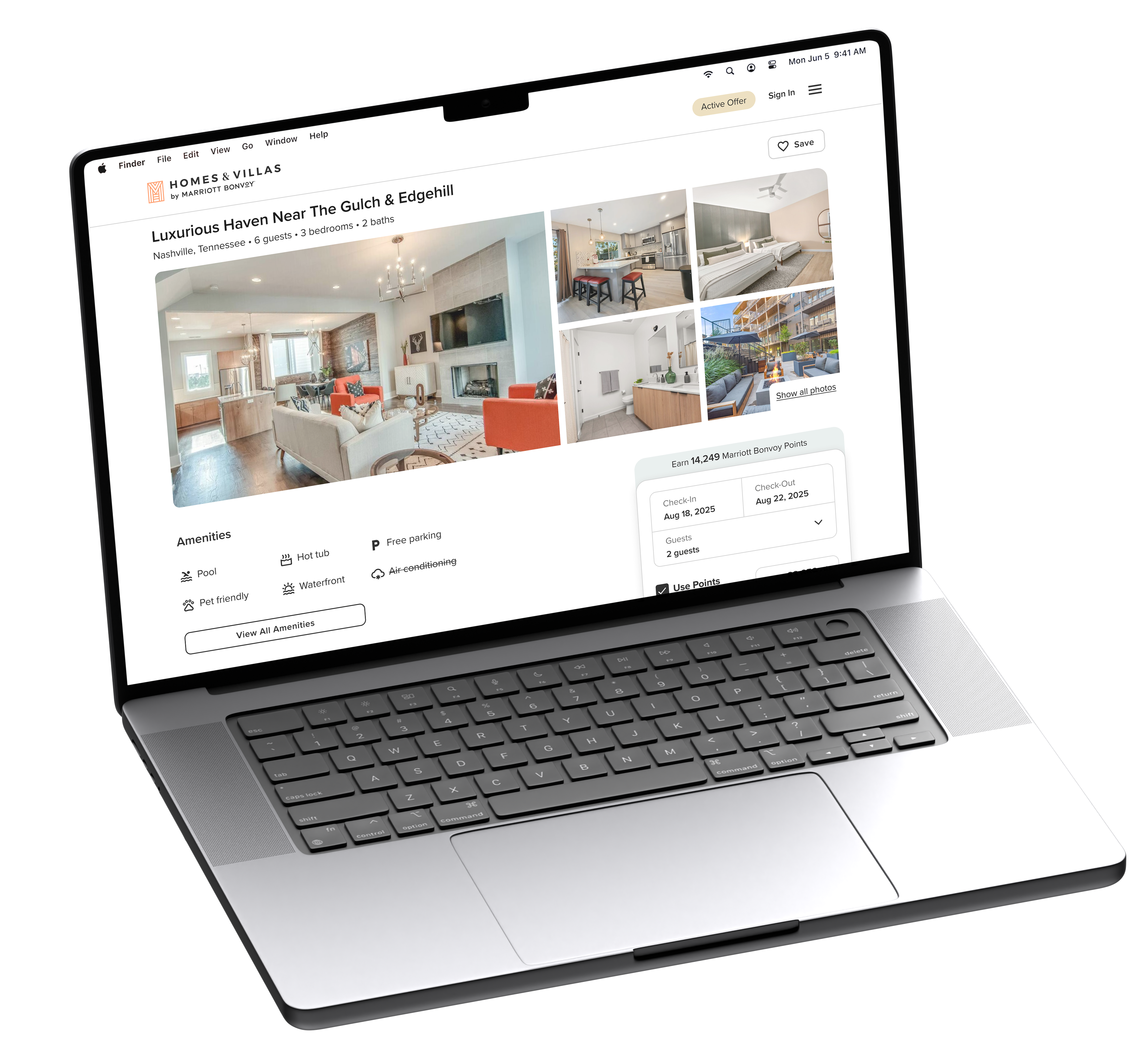
We had launched a high-performing AI search experience, but users were still landing in a booking flow built for a different era. Discovery got better. Conversion did not.
So we rebuilt the funnel, end to end.
The Approach
Outside of the updated search experience we'd just launched, the booking funnel had bounced between neglect and small incremental fixes. The issues were obvious, but we'd never had the runway to take a holistic approach.
This project changed that. We committed to redesigning the entire booking experience from discovery through confirmation. Every touchpoint was rebuilt around two principles. Mobile needed to feel native, and the funnel needed to be deliberate about what information to show and when.
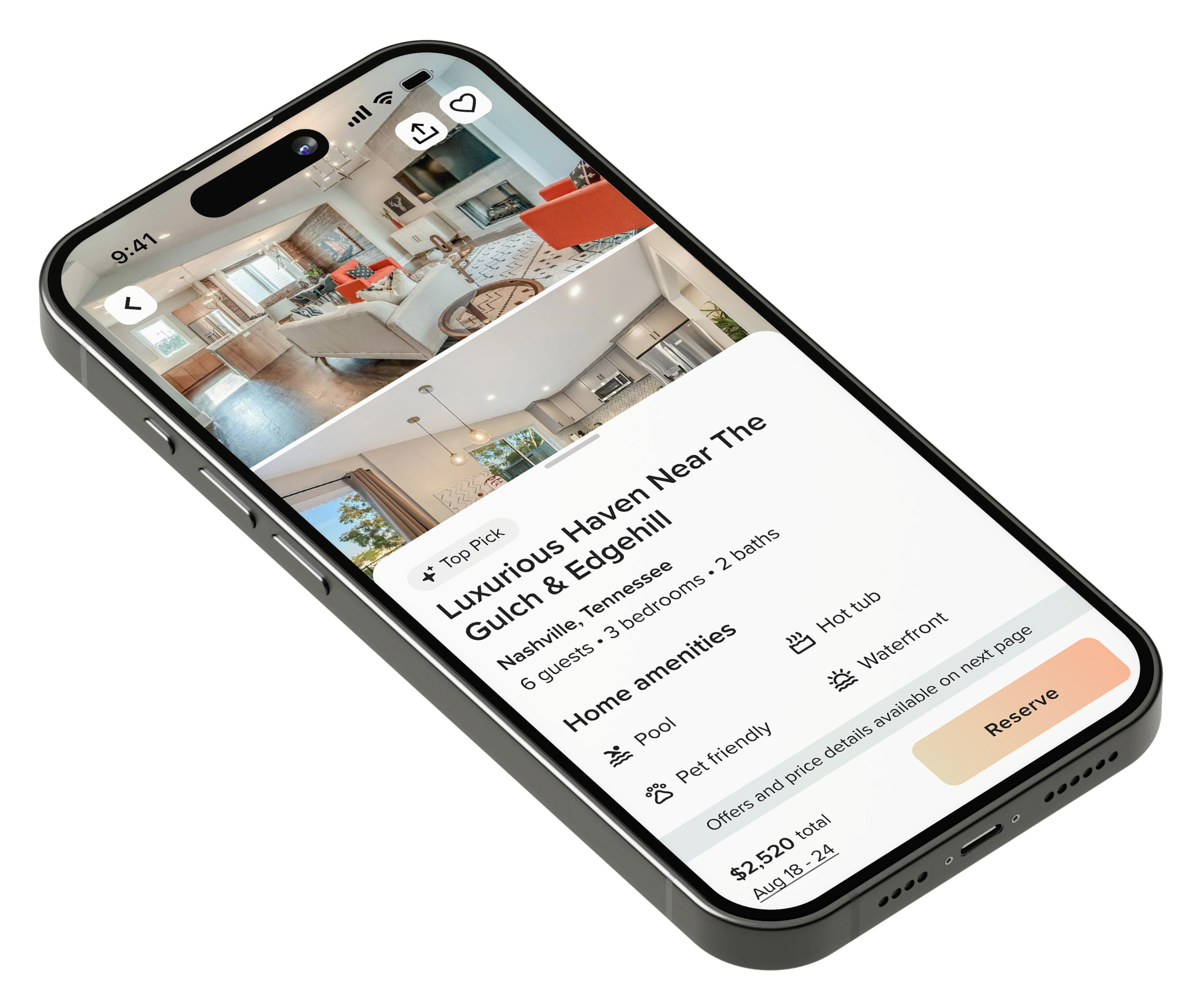
Nearly Native
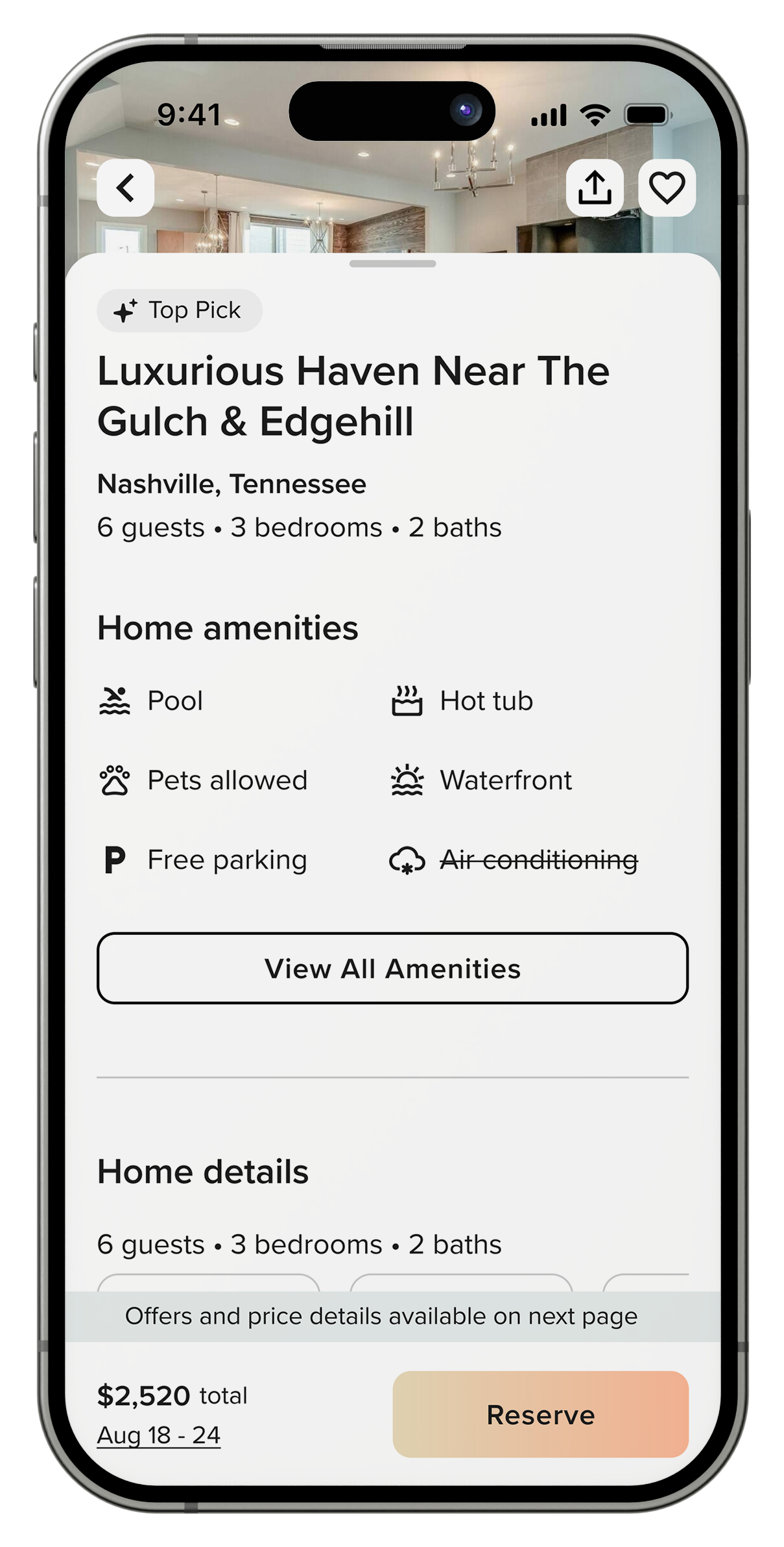
We had spent years discussing a more app-like approach to property browsing on mobile. The traditional scrolling page worked for desktop, but mobile users needed something more intuitive. Something that felt native, and the timing was finally right to execute on it.
The concept was a drawer interface that puts the gallery and property details in two distinct, swipeable layers. Users land on stunning property photography with key details in a drawer below. Swipe down to immerse in the gallery. Swipe up to dive into amenities, features, and booking details.
No more endless scrolling. No more hunting for the gallery. Just effortless switching between visual inspiration and practical information.
This was a significant departure from typical vacation rental sites. It felt more like a native app than mobile web. But for a brand competing with Airbnb's mobile experience, that was exactly the point.
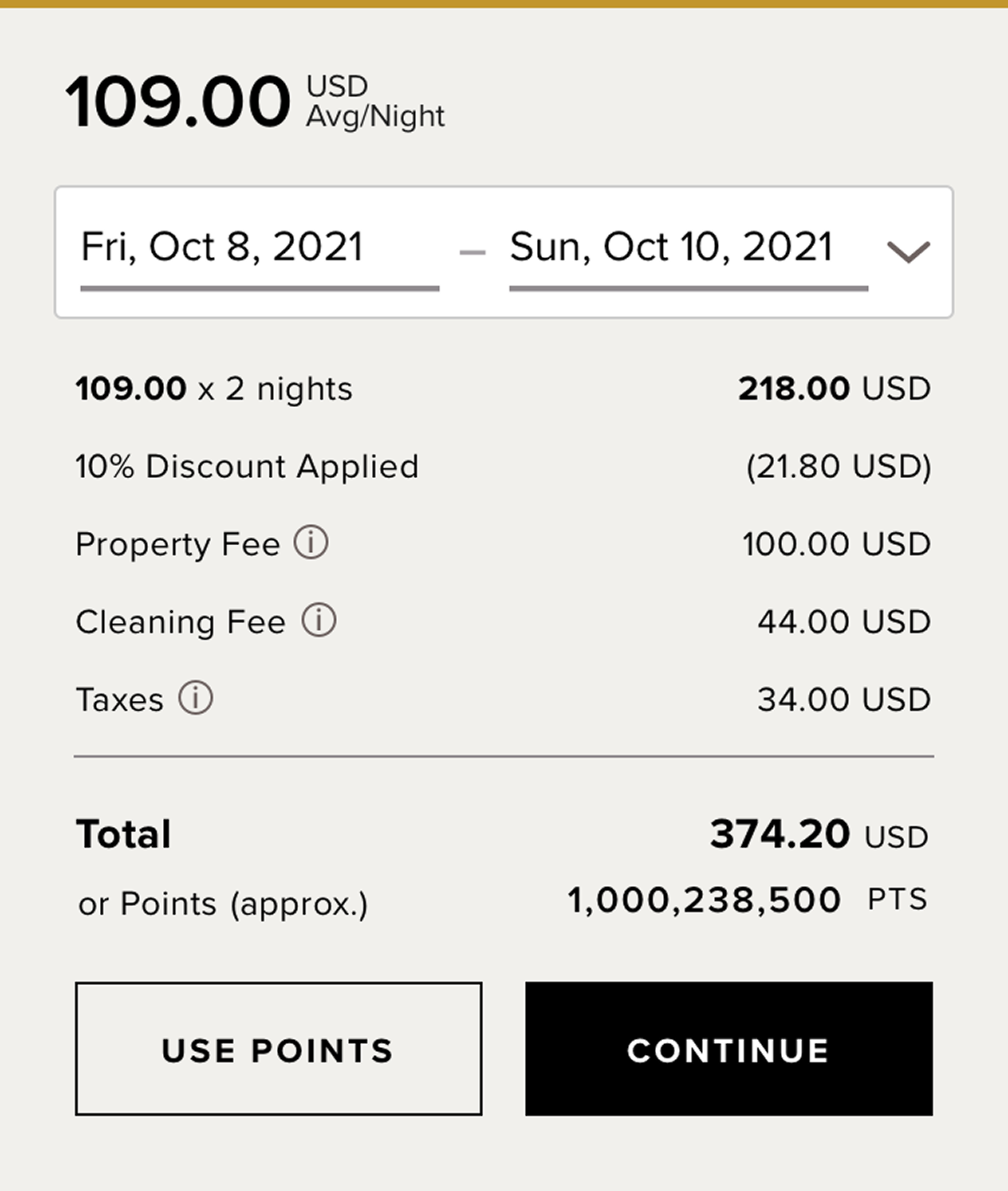
Old Ratecard
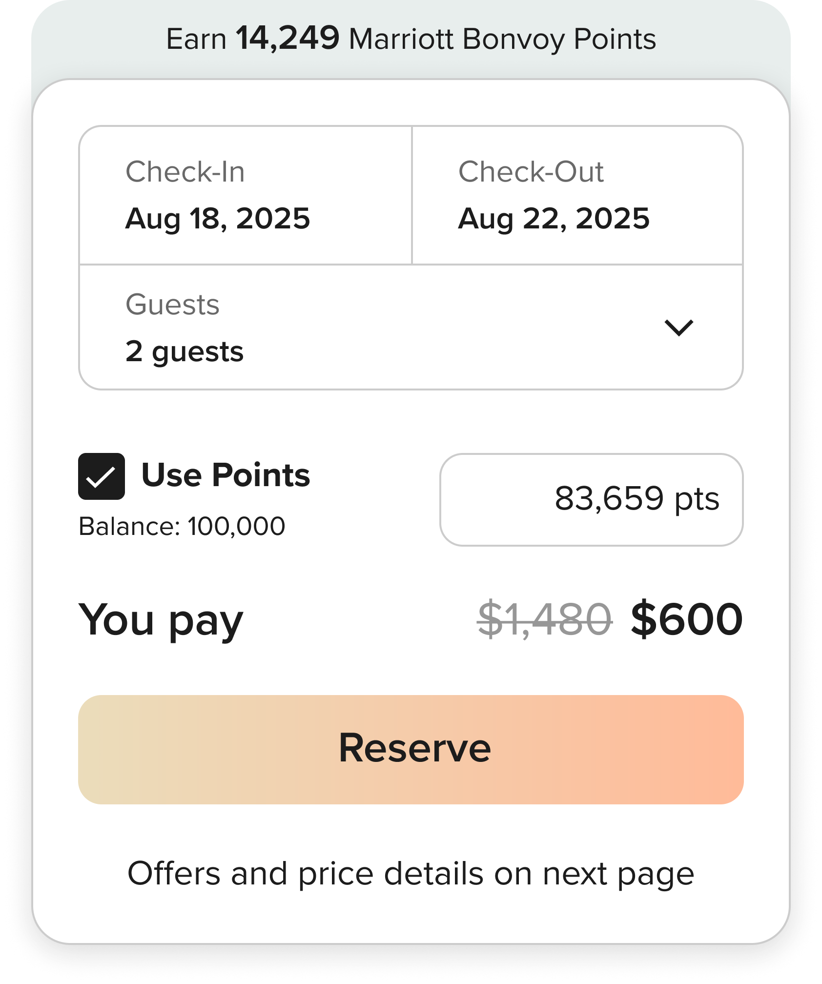
New Ratecard
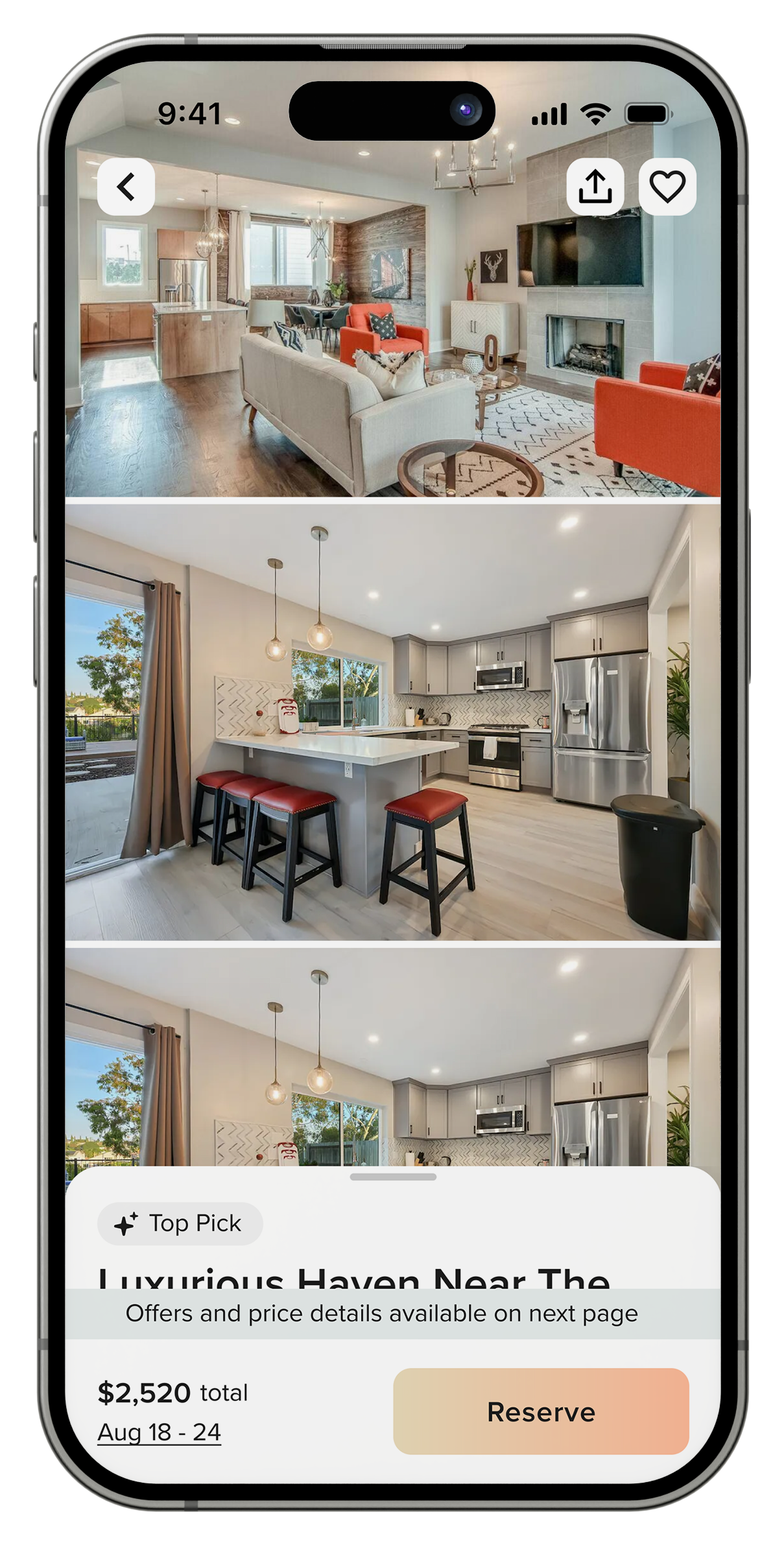
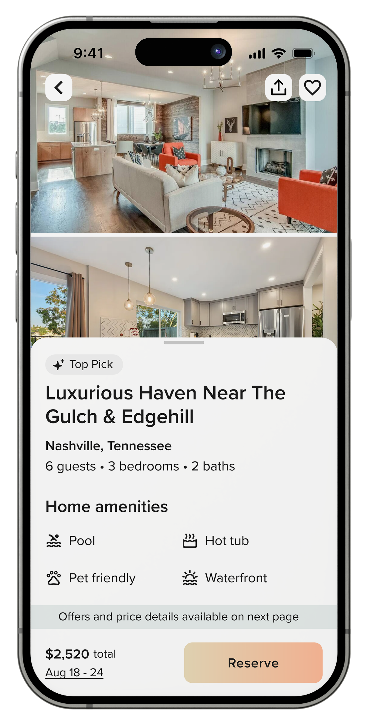
An Important Pricing Decision
We had always disclosed full pricing across the entire guest journey. But what would happen if we removed the pricing breakdown from the property detail page?
Not the total price, of course. Users could still see what they'd pay. But line-item details, taxes, fees and even offer breakdowns would move to the booking page, replaced with a clear message about full pricing details being available on the next page.
The reasoning was straightforward. If the goal is to drive users deeper into the funnel, what you share and when you share it matters. Overwhelming users with pricing complexity along the way was creating friction. Simplicity creates momentum.
Our theory was that we would drive more traffic further down the funnel than the increased bounce rate of the people who got there. And that's exactly what happened. Step conversion from property details to the booking page increased dramatically, with more users reaching the booking page than ever before. Booking page conversion dropped as expected because we were sending more browsing traffic, but total bookings increased anyway because the volume of qualified traffic more than compensated for the higher bounce rate.
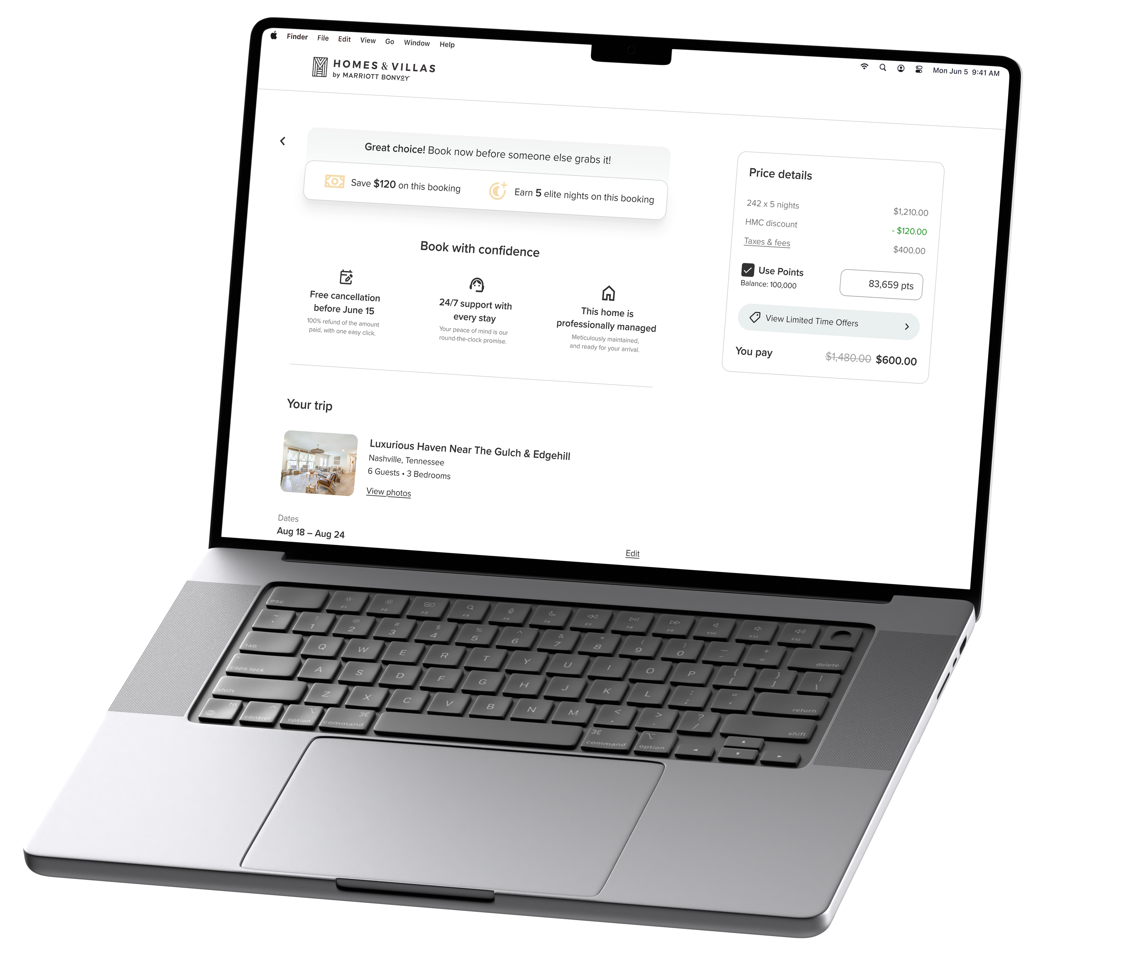
The Booking Page
Every slippery booking funnel needs a sticky booking page.
At one point, the booking experience had been spread across four different pages. That had been consolidated a couple years back, but it was never truly streamlined. No consideration had been given to keeping users there once they'd arrived.
First, we removed friction and distractions. Unnecessary language was cut. Multi-factor authentication moved behind the Pay Now button so there was no friction until commitment.
Then we added the capabilities users needed to finalize their decision without leaving. We introduced the ability to edit check-in and checkout dates, update guest count, and adjust points directly on the page. We allowed guests to apply offers without navigating away and carried the property image gallery through so they could look over images one last time before confirming their booking.
The result was a booking page that kept guests focused on the home, minimized off-ramps, and where the only remaining action was to book.
Influencing Behavior
Research shows that well timed prompts can influence decision making more effectively than static information. The right message at the right moment can shift behavior without feeling manipulative. So we added messaging to create urgency and drive longer stays.
Property pages got labels like "Top Pick" and "Going fast" when booking velocity or availability warranted attention. The goal was gentle pressure, not manufactured scarcity.
The calendar introduced conditional prompts tied to user actions. Select dates and you'd see "Add 4 nights for a weekly discount" or "5 more nights until your next Membership Tier." The value of extending a stay became immediately clear at the moment users were deciding how long to book.
Users completed more bookings when urgency was present. Average length of stay increased when incentives were visible in context.